Browse and copy production-ready SwiftUI components
Showing 1-10 of 20 snippets
by Luiz Mello
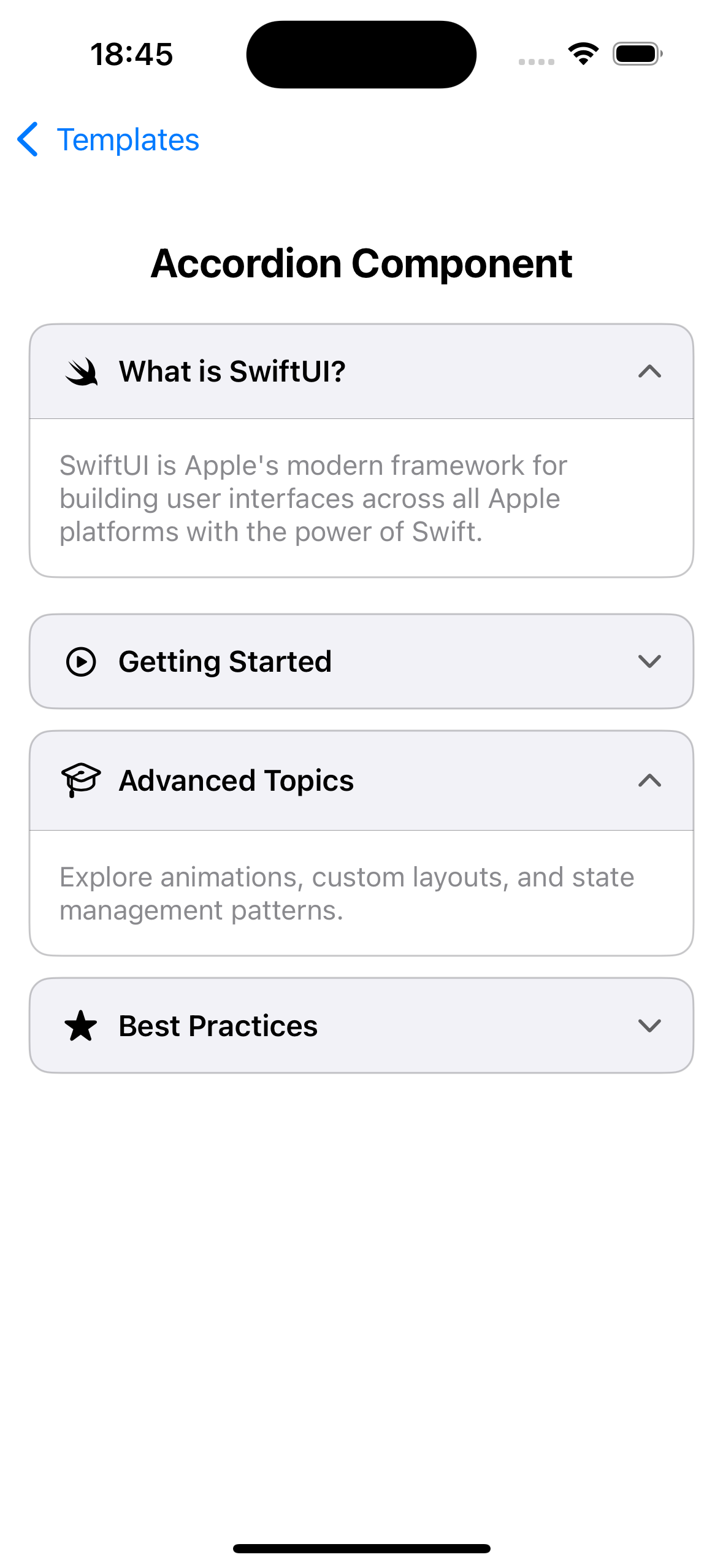
A customizable accordion component with smooth animations, multiple expansion modes, and custom styling options perfect for FAQs and collapsible content
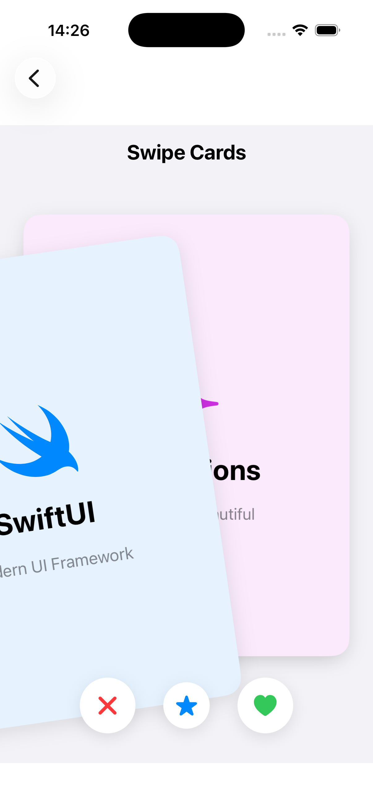
Tinder-style swipeable card stack with smooth animations. Supports swipe left/right/up gestures, visual indicators, programmatic controls, and customizable appearance. Perfect for dating apps, product browsing, or decision-making interfaces.
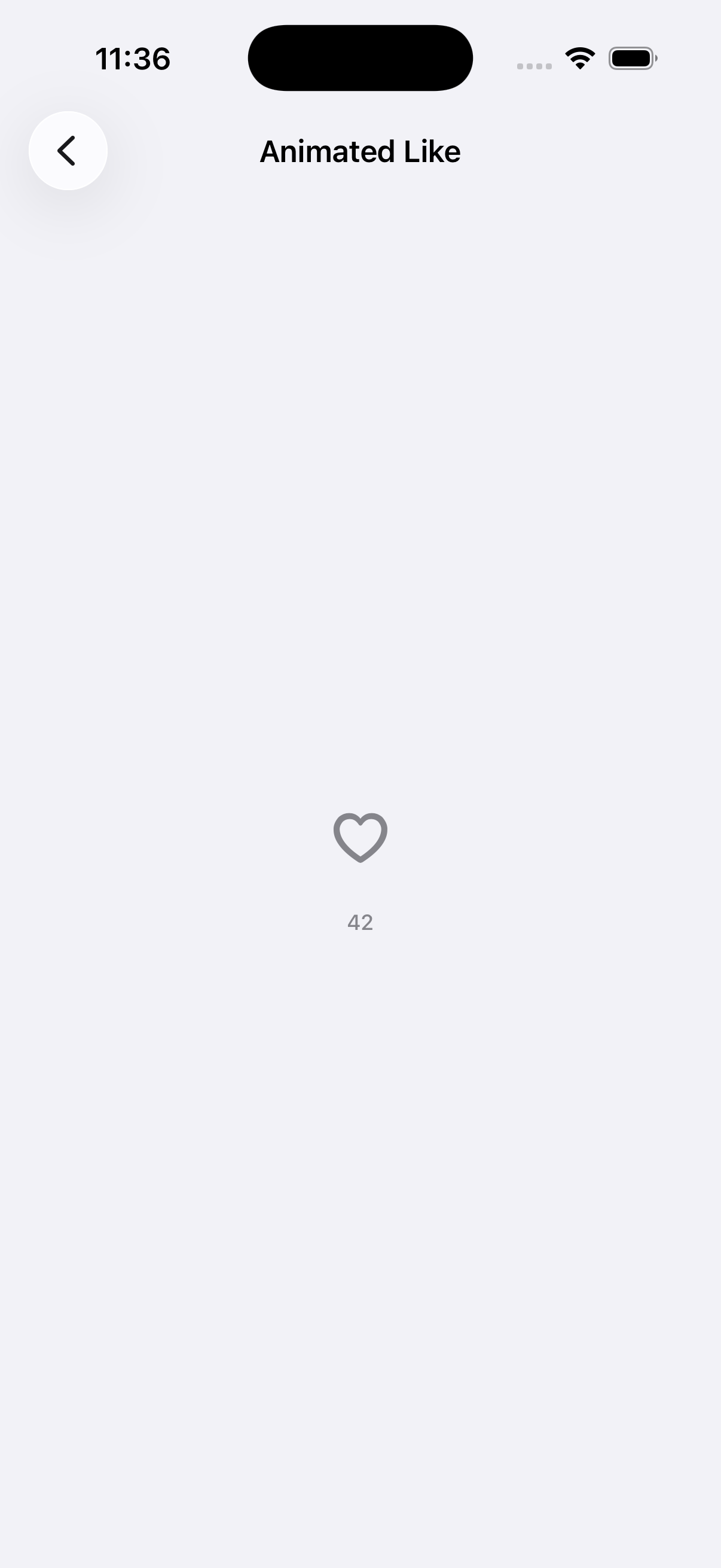
A heart-shaped like button with a spring pop, particle burst, and animated count updates inspired by social app interactions.
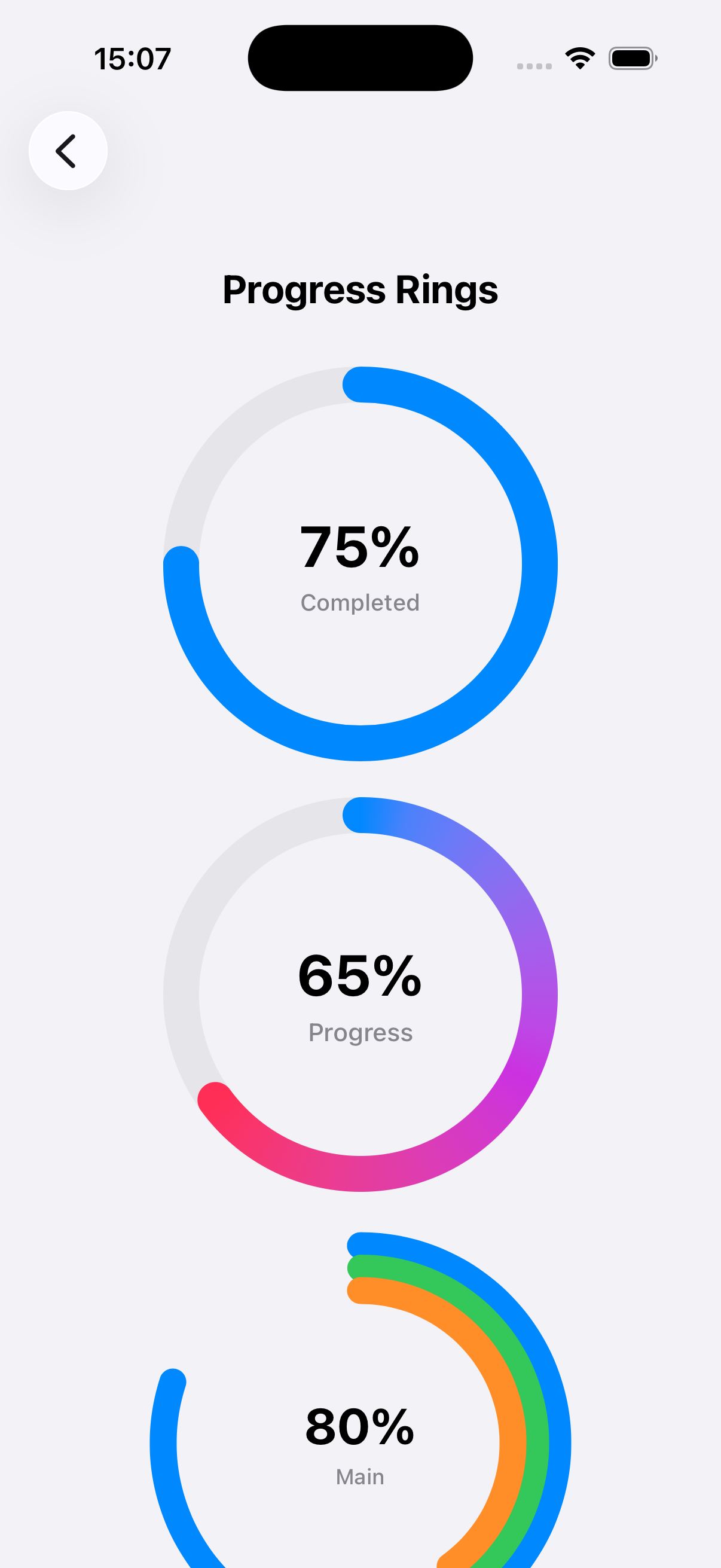
Beautiful circular progress indicators with smooth animations. Includes standard rings, gradient rings, multi-layer rings, segmented rings, and dotted rings. Fully customizable with colors, sizes, line widths, and labels. Perfect for dashboards and progress tracking.
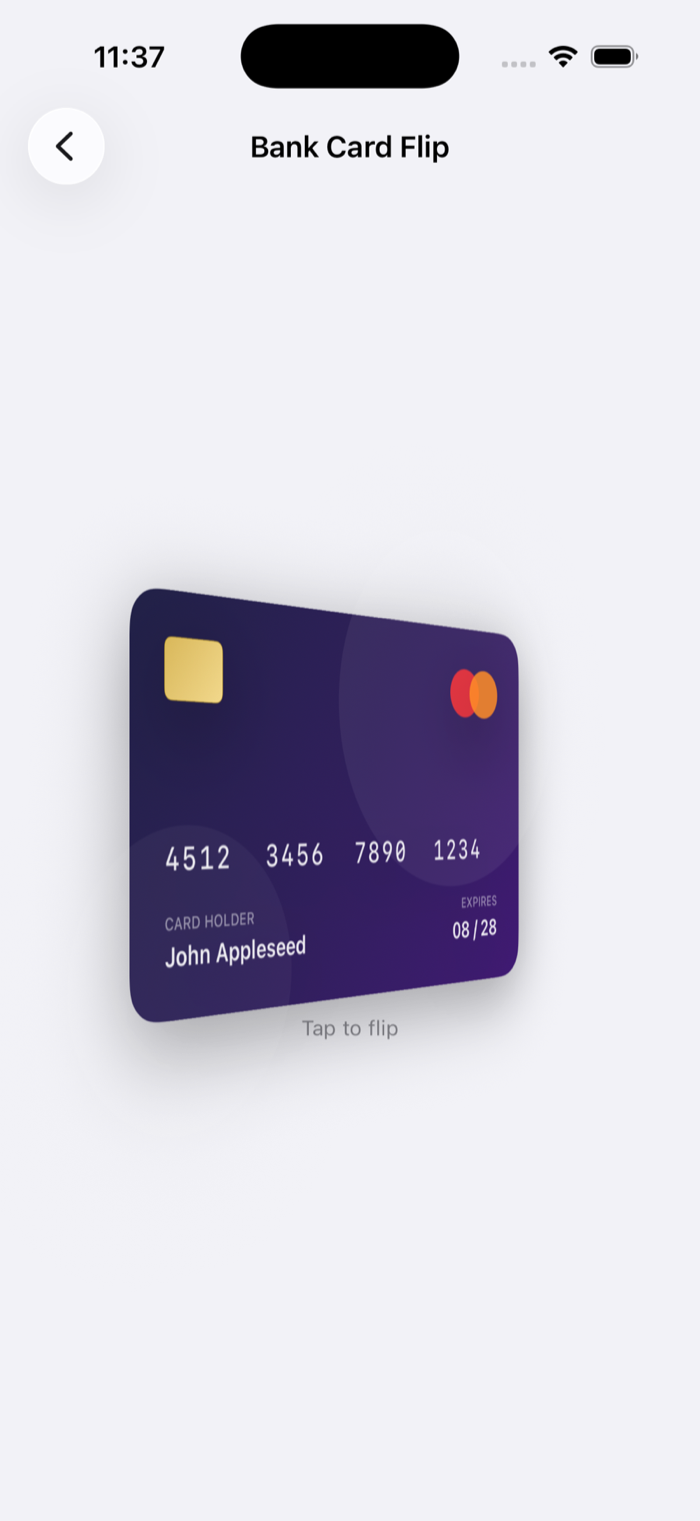
A credit card component that flips in 3D on tap to reveal the back side with smooth perspective and polished banking visuals.
A scrollable feed of skeleton-style cards with a smooth zoom navigation transition to a detail view. Uses matchedTransitionSource and NavigationTransition for a native iOS 18+ feel.
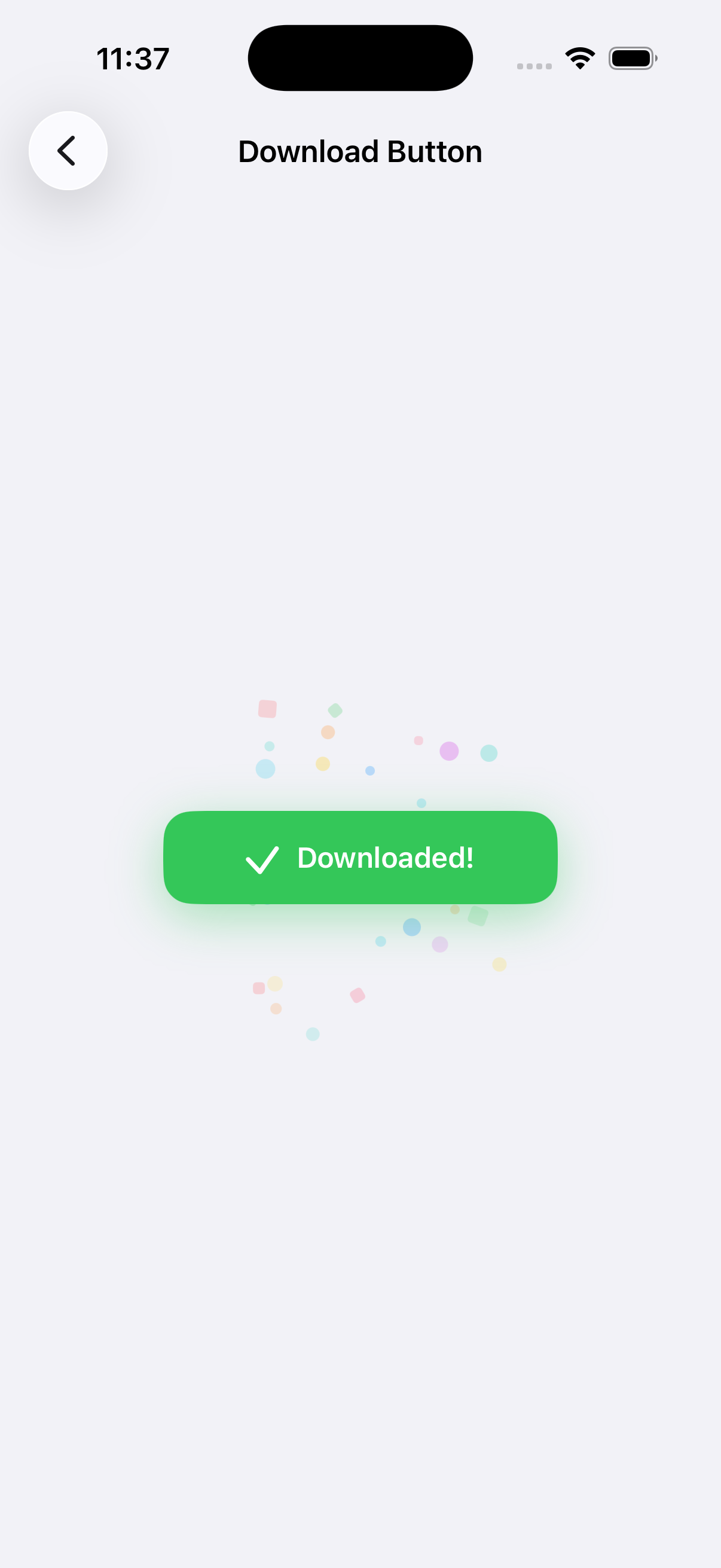
An animated download button with progress tracking, state transitions, checkmark completion, and celebratory confetti.
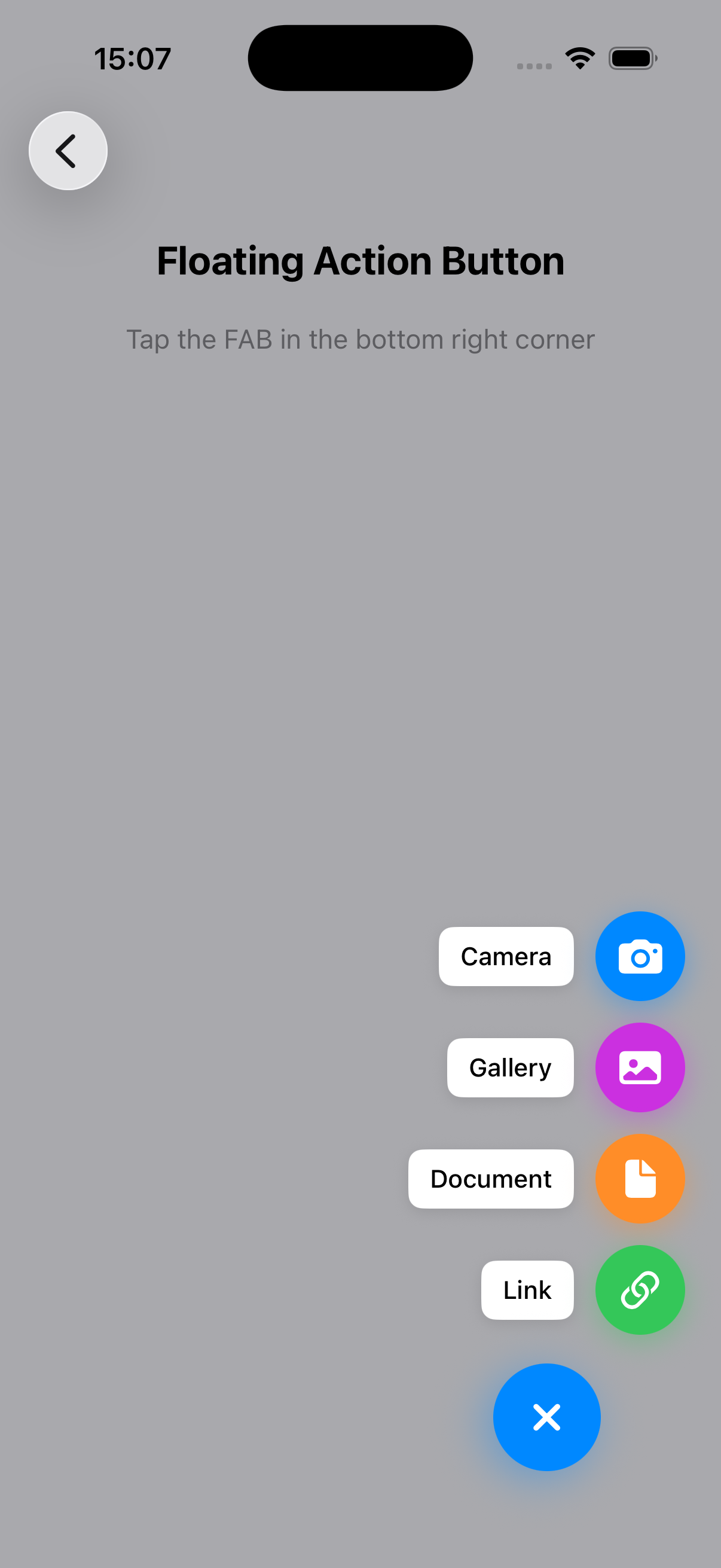
Elegant FAB with expandable menu of actions. Features smooth animations, customizable positions (all corners), labels, overlay backdrop, and Speed Dial variant. Perfect for quick actions in your app.
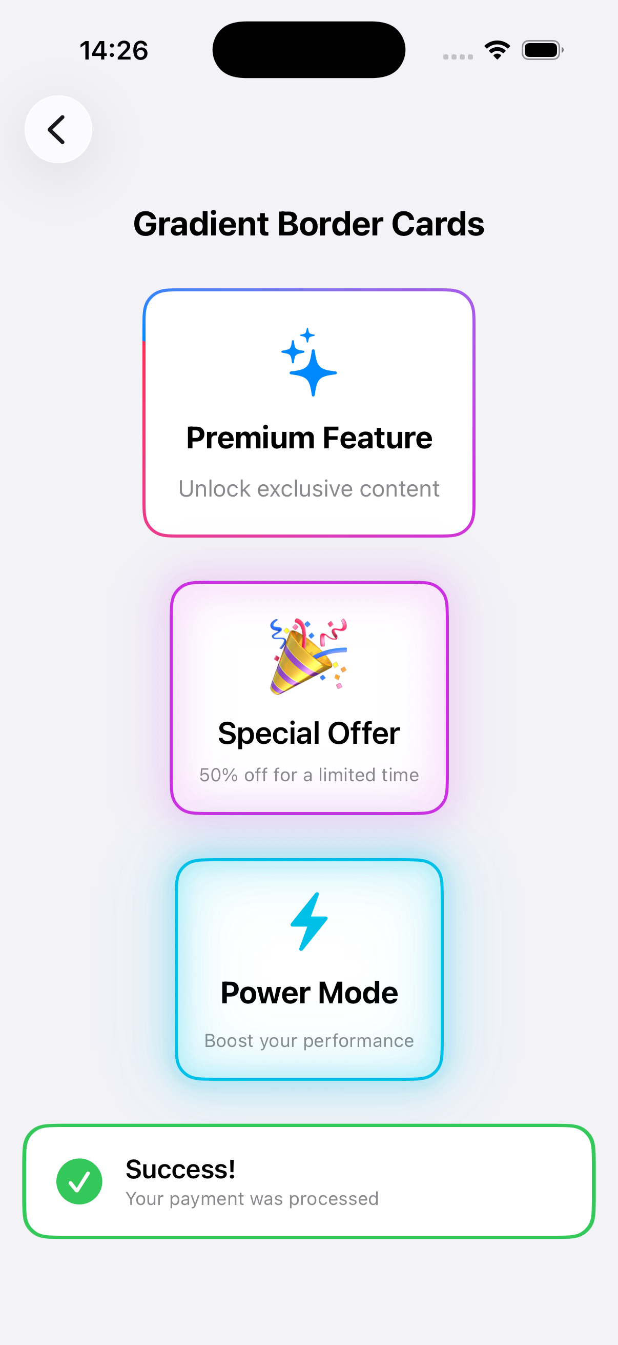
Stunning cards with animated gradient borders. Includes rotating gradients, glowing borders, dashed borders, pulsing effects, neon borders, and shimmer effects. Multiple preset styles (rainbow, fire, ocean, sunset) and fully customizable. Perfect for premium features and special content.
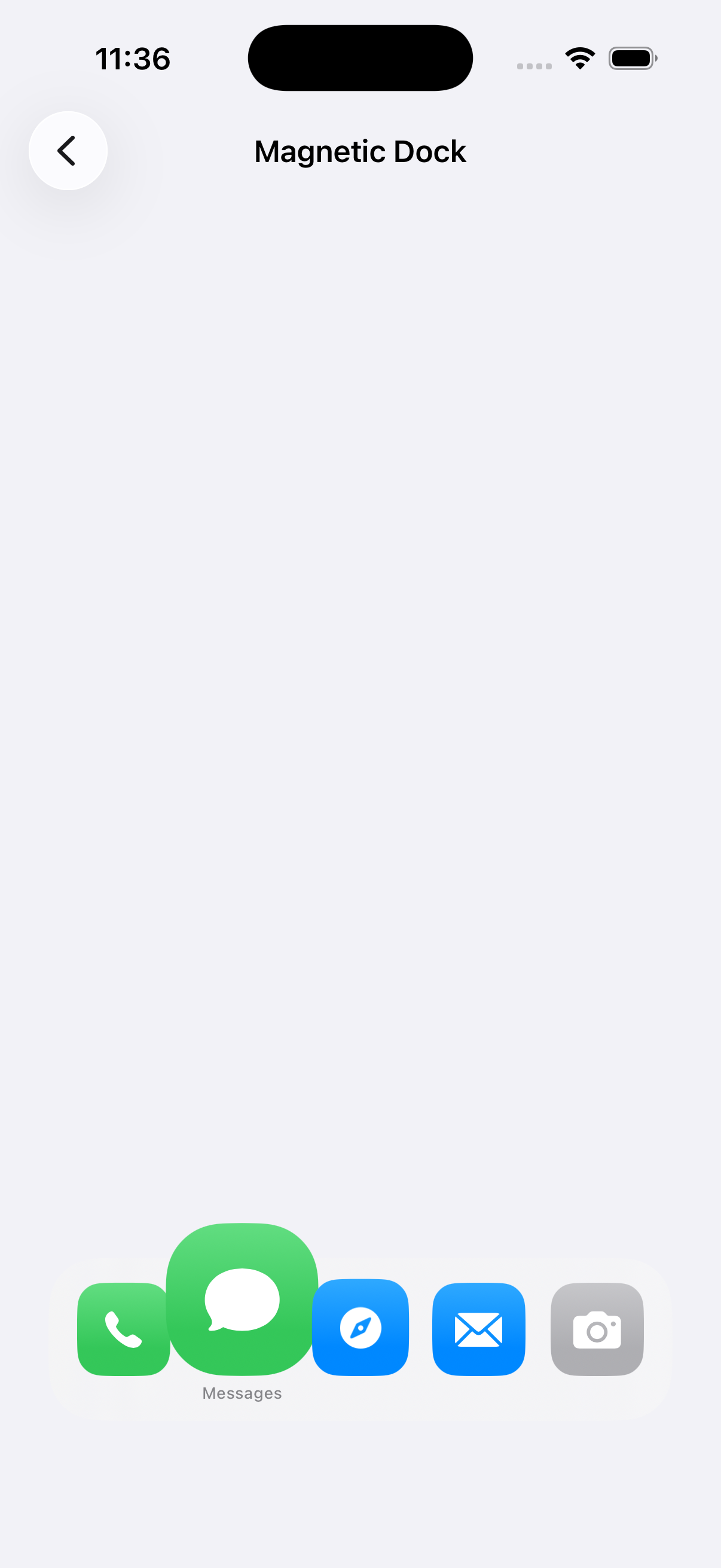
A macOS-style dock that magnifies app icons based on pointer proximity with smooth interaction and spring motion.